我们经常会遇到这种情况:需要把特定的坐标轴标签用不同的颜色进行高亮。
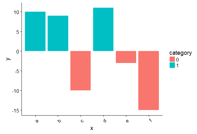
例如我们画这么一幅图:1
2
3
4
5
6
7
8
9
10
11
12
13
14x <- c("a","b","c","d","e","f")
y <- c("10", "9","-10","11","-3","-15")
data <- data.frame(x, y)
data$y <- as.numeric(as.character(data$y))
data$category <- ifelse(as.numeric(data$y)<0, 0, 1)
data$category <- as.factor(data$category)
#Graph
library(cowplot) #theme
library(ggplot2)
ggplot(data, aes(x=x, y=y)) +
geom_bar(stat = "identity", aes(fill=category)) +
theme(axis.text.x = element_text(angle = 45, hjust = 1)) +
theme(axis.text.x = element_text(colour = "black"))
这个画图里面用到了一个比较抽象的ifelse()函数,该函数1
ifelse(b,u,v)
其中b是一个布尔向量,通常为一个判断值,u和v为向量。如果b[i]为真,则返回的第i个与秦素为u[i],如果b[i]为假,则返回的第i个元素为v[i]。例如:1
2
3
4
5
6> x <- 1:10
> x
[1] 1 2 3 4 5 6 7 8 9 10
> y <- ifelse(x %% 2==0,5,12)
> y
[1] 12 5 12 5 12 5 12 5 12 5 ###如果能被2整除,则返回5,如果不能则返回12
然而如果我们想将x轴小于0的标签标为红色,应该如何操作?
可以先根据data$category来进行判断,指定每个向量的颜色:1
a <- ifelse(data$category == 0, "red", "blue")
然后1
2
3ggplot(data, aes(x = x, y = y)) +
geom_bar(stat = "identity", aes(fill = category)) +
theme(axis.text.x = element_text(angle = 45, hjust = 1, colour = a))
其中向量a的内容如下:1
2> a
[1] "blue" "blue" "red" "blue" "red" "red"
其中theme()中的colour=a是将a这个指定颜色的向量透射到colour上,于是生成如下的图: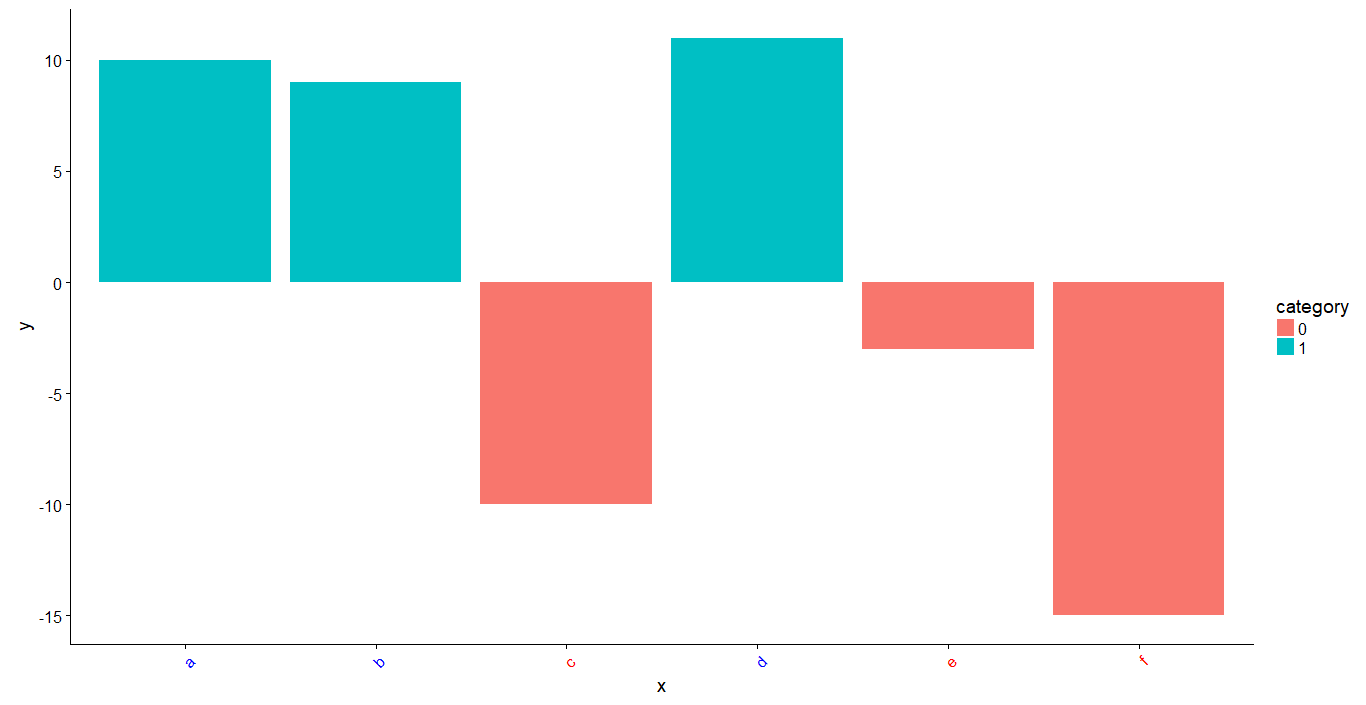
完整代码:1
2
3
4
5
6
7
8
9
10
11
12
13
14
15
16x <- c("a","b","c","d","e","f")
y <- c("10", "9","-10","11","-3","-15")
data <- data.frame(x, y)
data$y <- as.numeric(as.character(data$y))
data$category <- ifelse(as.numeric(data$y)<0, 0, 1)
data$category <- as.factor(data$category)
#Graph
library(cowplot) #theme
library(ggplot2)
a <- ifelse(data$category == 0, "red", "blue")
ggplot(data, aes(x = x, y = y)) +
  geom_bar(stat = "identity", aes(fill = category)) +
  theme(axis.text.x = element_text(angle = 45, hjust = 1, colour = a))
参考: